Marketers and designers work together all the time. There’s a lot of lingo in both of those fields and sometimes, things just don’t translate. 😥
If you’ve ever heard the term hamburger menu and started to think about Burger King, then this one’s for you. 🍔 (This is me, I’ve done this.)
If you’re anything like me, you may have found yourself sitting in a design meeting, wondering what the heck is going on. I know I’m not the only one. So I created this guide to the ABCs of “marketing design.” It’s got all the terms you need to know to bridge that gap between creative and marketing—making you look like the smartest person in the room.
If you want to walk the walk, you’ve got to talk the talk.
A
Above the Fold: The top portion of a web page that is visible without scrolling.
This term has roots in the newspaper biz, where “above the fold” referred to the content that was, literally, above the fold of the paper. This content could be seen while the newspaper was folded up and lying on the stand. Today, it more commonly refers to the top part of a website that you can see before having to scroll down.
B
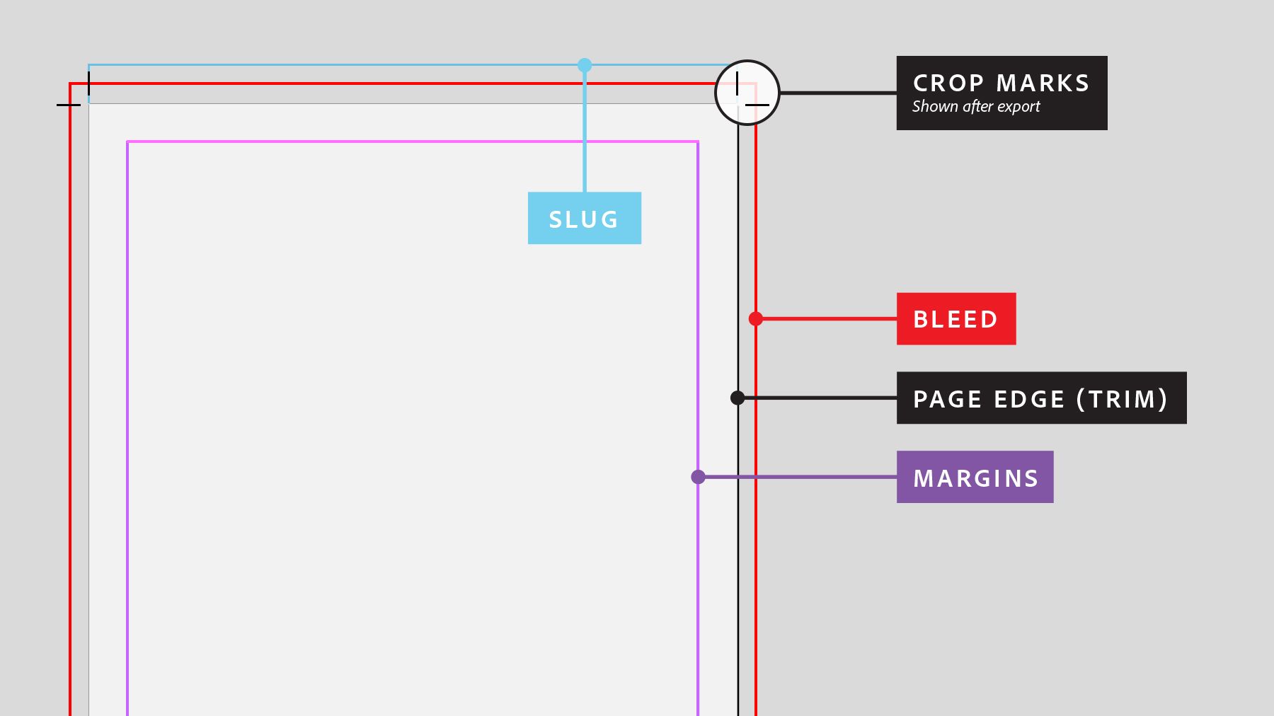
Bleed: Printing that goes beyond the edge of where the sheet will be trimmed.
There are a bunch of terms to talk about the print area of a document. Gutter, slug, bleed, crops, trims, margins… it’s enough to make anyone’s brain hurt. Here’s a handy dandy guide to what it all looks like:
C
Color Systems: A system for creating a full range of colors from a small set of primary colors. These commonly include RGB, CMYK, HEX, PMS (Pantone), among many others.
Okay okay, but what does this actually mean? Here’s a crash course:
PMS = printing with a few spot colors
CMYK = printing with full color
RGB = general onscreen
HEX = onscreen for websites.
D
Dummy text: Dummy text is copy that shares some characteristics of the real, final copy, but is random or otherwise generated. The industry standard is lorem ipsum, a piece of latin literature dating back from the 1500s. Also called Greeking.
You can generate lorem ipsum here. Or, you can spice things up a bit and go with some hipster ipsum. Or pirate. Or, my personal favorite, cupcake ipsum. 🧁
E
Editorial Illustrations: Images in online and print publications that accompany articles, grabbing attention, bringing stories to life and expressing complex ideas. These can be hero images, spot illustrations, infographics or any art needed to help the reader engage with the content.
F
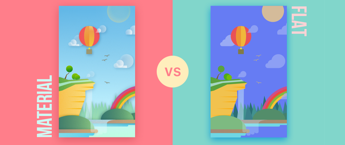
Flat design: A minimalistic design that features clean, open space, crisp edges, bright colors and two-dimensional illustrations. It helps with usability and is considered a very user-friendly design style.
A popular variation on flat design is material design, developed by Google. The idea behind material design is that users get lost when everything is flat, so this new style adds shadows and accents to some of the more subtle features of the design. Every day you’re using a Google product you’re using material design. Here’s a handy reference guide:
G
Grid: A system for organizing layouts that is made up of horizontal and vertical lines to help align and structure content.
If you chat with a graphic designer for longer than five minutes, you’re going to hear about grids. They’re the basis text and web layout, and designers can’t live without them. They can get obsessed.
Everything has a grid. Your word doc, your powerpoint, your business card, your infographic, everything! One of the easiest ways to level-up any design is to turn on your grid and make sure everything is aligned with a line. Seriously. Grids are important.
H
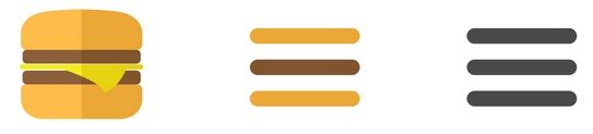
Hamburger Menu: The icon in web design that signifies a collapsed menu, named for its unintentional resemblance to a hamburger.
You know what I’m talking about, I promise:
I
Iconography: A simplified image meant to represent an object or action to be taken.
Icons are an important form of visual communication. Visuals are far more impactful for your audience than reading or listening, so leaning on visuals like icons are a great way to get your message to be heard. 📣
J
JPEG: A commonly used method of lossy compression for digital images.
JPEGs, PNGs, GIFs, oh my! I could write books about the different types of image formats. But instead, let’s check out this cheat sheet:
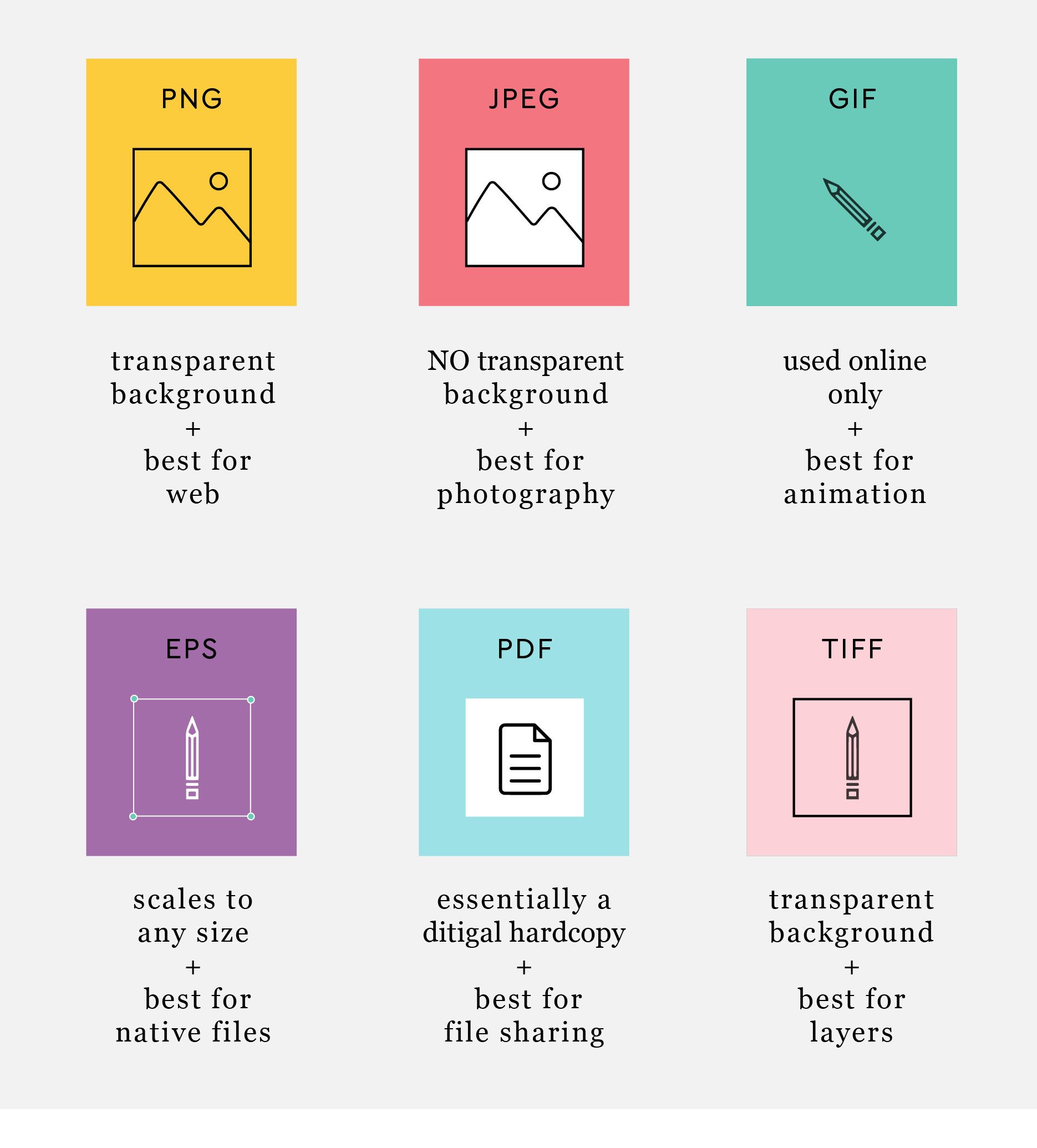
Want to dive a little deeper? This infographic tells you everything you need to know (and more) about image file formats!
K
Kerning - The process of adjusting the spacing between characters in a font make the lettering more visually pleasing.
Also important definitions to know:
Leading: Determines how text is spaced vertically in lines.
Tracking: Adjusting spacing throughout the entire word.
Want to test your skills? Try this game. Need a visual? Here ya go:
L
Logo: A graphic mark, emblem, or symbol to identify and recognize a brand.
But there’s more to it than that. Here are some other terms to know:
Logomark or Brandmark: The symbol or icon within a logo
Wordmark: The text/typographic treatment of the name within a logo
Logo lockup: The full logo that contains both the brandmark and wordmark
M
Mockup: A visual way of presenting a rough concept for your product or design.
When designing a landing page, the process is typically sketch (rough concept, on paper) -> wireframe (refining the concept, move to digital) -> mockup (add visual and design elements).
N
Negative Space: The space around/between the subject of an image, also commonly referred to as white space. If you’ve ever been frustrated watching a presentation where the speaker crammed as much text as possible onto every slide, you’ve wanted to see more negative space.
Think: The Google homepage. ⚪◽❕
O
Orphans: A word or two on a line by itself at the bottom of a page or column. Orphans appear separated from the rest of the text and make the layout look less clean and crisp.
Similar to orphans, a widow is a single line from a previous paragraph that carries over onto the next page.
P
Pull Quote: A phrase or quotation pulled out from an article and used as a visual element.
Pull quotes are a great way to break up dense text or to call attention to a specific line in an article. I mean look... 😍
Q
Quick Mask: A Photoshop mode that lets you (quickly) select objects for editing.
Quick masks can shave hours off of your Photoshopping project. Check out some super easy tips and tricks here.
R
Rule of Thirds: A photo composition technique where you divide the image frame into thirds and position your shot accordingly. When you place the focus of the image along one of these third lines, your photo will become more balanced.
Like so:
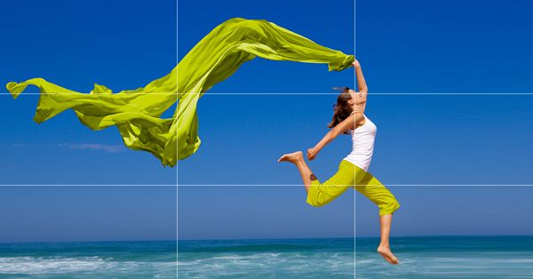
The same applies for almost all layout—from a text-based case study to display ads. And you’ll find that most Grids (remember way back when you were on “G”?) are based on multiples of 3.
S
Stock: Graphics or images that have already been created.
Stock is more than cheesy stock photography that you pull from the internet. Stock just means any assets that have already been created (are “in stock”) that you don’t have to make new to fulfill a specific need. This can be anything from icons you download from a stock site, to an archive of product shots your company has stored on an internal server.
T
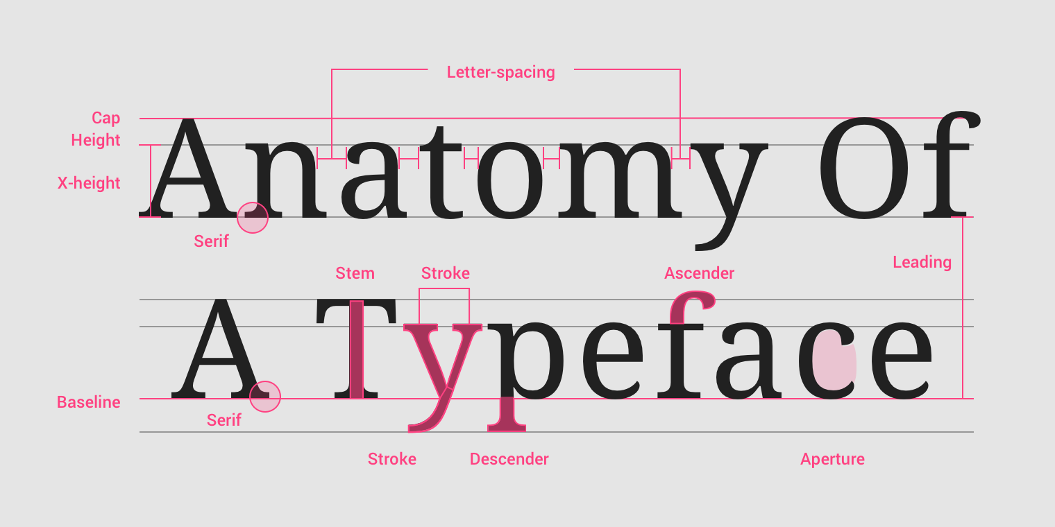
Typography: The art of making printed characters legible and visually appealing.
Typography is truly an art form in and of itself, but here’s a little crash course so you can know the difference between serifs and sans serifs next time they’re debated in a meeting:
U
Universal Design: The art of making design accessible to any viewer or user.
Great design caters to all needs. That’s no small task. For example, is your website perfectly accessible for someone who is colorblind? How about someone with arthritis in their hands or fingers? Someone who is visually impaired, hard of hearing, or speaks another language? The answer is probably not.
Fortunately, there are resources out there to audit your website and create designs that make strides towards being universal design. 🌎
V
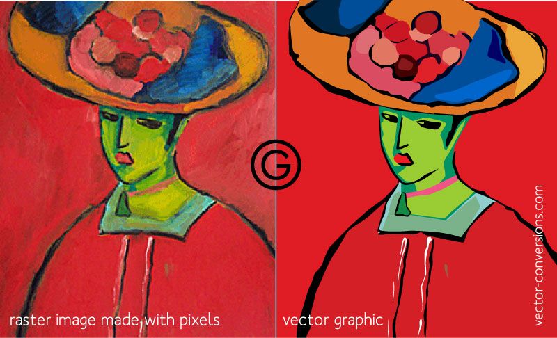
Vector: Graphics based on points, lines, and shapes based on mathematical formulas. Conversely, a raster (or bitmap) graphic is based on filling in colored blocks called pixels.
Vectors can be filled with different colors, blends, or gradients but ultimately display a single color each. Rasters can be blend since information is stored in the pixel rather than independent shapes. You’ll probably recall a designer asking you for a “vector” version of your logo–and the reason she’s asking for a vector is that they can be printed at extremely high resolution. A raster image is limited in size, and will start to look blurry when scaled up or printed.
Here’s what the same image may look like in raster and vector:
W
Web safe fonts: Fonts that are pre-installed on most operating systems.
Wait, aren’t all fonts web safe? No! There are a ton of fonts out there, and more are created every day. When you use a font in a design, you need to install it on your machine. Then, the viewer of the design will likely also need the font installed on their machine. If you’re using something like PowerPoint, which does not manage fonts, it can become a huge mess, fast.
A web safe font is basically just a “safe bet” that it will be compatible with wherever you send it. How do you know what those fonts are, you ask? Check this list.
In the last five years, Web Fonts have become commonplace. Google Fonts are free and widely available. They’re not quite as available as system fonts, but close–and let you be much more expressive with your typography.
X
Xd, Ps, Ai, Lr, etc. The Adobe Creative Cloud: A suite of applications and services from Adobe Systems for graphic design, video editing, web development and photography.
The Adobe Suite is pretty much the gold standard when it comes to design. Learning how to use these tools is a powerful way to bridge the gap between marketing and creative. 🏅
Y
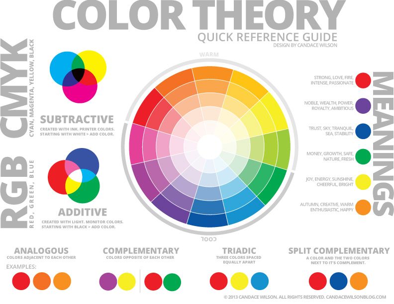
Yellow, Red, and Blue: The three primary colors. These colors make up all other colors and are the core of color theory.
Color is a powerful part of design with subtle effects. Studies have shown that different colors can make people feel differently about a brand. Here’s a little guide to jump start some of your thinking:
Z
CMD/CTRL + Z: The keyboard shortcut for undo.
Ahh command Z. The reason I still have my sanity. This is just a little tribute to the shortcut that has always had my back. You da bomb 💣