Okay folks, let’s talk budget.
You’ve probably seen this Venn diagram about design:

But I think this one is more realistic:

Faced with limited resources and tight deadlines, we all have the temptation to just roll up our sleeves and grumble, “I’ll just do it myself.”
It’s tempting to take these projects on yourself to save costs, but think about the cost that has on you. I bet you already have too much on your plate, and the last thing you need is another line on your to-do list.
It’s time to stop giving yourself more things to do. You have access to more resources than you think; the trick is just using them efficiently.
Here are some tricks of the trade to make your design budget go further. Saving you time, energy, and sanity.
Invest in the “building blocks”
Sure, it’d be awesome to have custom brand fonts, new illustrations in every blog post, and a vault of custom stock photography. It’d also be awesome if I had a million dollars and was married to Ryan Gosling. But we’ve got to think realistically here.

Think about what’s actually possible for your company. You don’t have the same budget that a multi-billion dollar brand has for design, so you shouldn’t expect to have the same depth of assets to work with.
Focus your attention on a more realistic path.
Instead of sinking your money into one-off assets, stretch your budget by investing in design “building blocks.”
You want to put your budget into things that have the longest shelf life, the pieces that build up and establish your brand. For example, a PowerPoint template is something that can be used by everyone in the company, over and over again. And with a great template, you can have building blocks (layouts, shapes, charts) that can be reused as you create other collateral.
If you’re working with a limited design budget, ask yourself this before you invest in a new project: can I use this in 3 different ways? If the answer is no, maybe your budget is best spent on something else. If the answer is yes, go forth and design!
Use a simple design
It’s tempting to gravitate towards the razzle-dazzle of a design with lots of hand-drawn illustrations and patterns. And hey, they do look really cool.
But you know what else they are? Expensive.
Hand drawn illustrations require, well, someone to illustrate them. Meaning every time your team needs a new ad campaign, landing page, or presentation, you’ll need to go back to an illustrator to get new art...and that’s going to take more time and more money. 💰
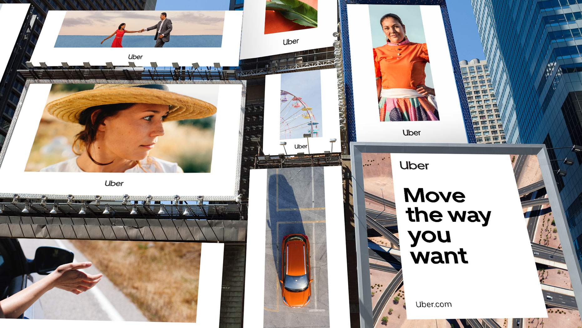
And remember how, earlier, I said you can’t pretend like you’re a billion dollar brand? Well, even billion dollar brands need to cut back on their design to become more efficient. Uber– which I’m pretty sure heats their offices by burning stacks of hundred dollar bills– had efficiency in mind with their recent rebrand.
Their old branding from 2016-2018 was very pattern and illustration heavy:

To create new collateral, their marketing team needed to ask a designer for new illustrations in the same style, or have the skill set to alter the vector images themselves. It was much harder (and more expensive) to shepherd things through to publish.
But with Uber’s rebrand in 2018, the company took on a much more simple (and even more powerful) design that is easier for their partners and marketing teams to extend.

So in summary, simple = savings. That equation will always be true whether you’re a one-person startup or a zillion dollar international brand.
Don’t start from scratch
Starting from scratch is the most expensive way to start designing. And if you’re working with outside designers, time spent on a project is almost always exactly proportional to price.
When starting a project, make sure you come prepared with as much as you can upfront.
What helps speed up the process? Wireframes, templates, sketches, moodboards, you name it. Just don’t come to the table with nothing. The more you can provide upfront, the less time your project will take, and the cheaper it will be. 💸🍕

Communicate Communicate Communicate
Time is money. If you’re trying to stretch a design budget, solid communication is key. Poor communication is one of the easiest ways to drive up the cost of a project - and when you’re pinching pennies, that’s the last thing you want.
So how do you make sure those communication time wasters don’t happen? It starts with a strong brief. To keep a project from spiraling out of control, narrow your scope and be crystal clear about what you need.
Once the project is underway, you’ll need to keep the lines of communication open. Delivering direct feedback can be stressful, but it’s worth it. The worst problem we’ve seen on our own projects is when customers don’t get back to us with actionable advice; ghosting on feedback is the surest way to waste money.
Don’t forget, design is a process–and that process is driven by communication.
Be honest with your budget
Don’t be scared to share the budget you have in mind for a project. If your budget is reasonable, any agency or designer worth their salt will work with you to alter scope to fit your budget.
Think of it like this: you walk into a car dealer and a salesman asks about your budget. You say “oh I don’t really have anything in mind, let’s just see what I can find,” even though in your head you know you only have $15,000. They’re going to show you the nicest (and probably most expensive) cars on the lot, and, after a few hours, you’re both going to walk away frustrated and car-less.
Don’t let yourself do that with design. Talk honestly about your budget at the beginning. If you have a hard budget (and hey, everybody has budgets, there’s no shame in it), work with your design team to narrow the scope to land the project on time and on budget.
Bonus Round
Sill need to squeeze a little more out of your design budget? Here are some more tips.
- Free stock resources: Adobe stock is awesome, but there are also a lot of free resources out there. Try Pexels and Unsplash for stock photos, or Icons8 and Pixabay for vectors.
- Ask around: See if another department in your company has resources you can use, or heck, maybe even a little budget to spare!
- Cut conferences: Travel is expensive. Improve your team’s skills with online learning sites like Treehouse, Lynda, and Coursera.
