A cover page is a quick and easy way to add polish to your presentation. We'll cover a few tips for creating a great cover image, and we've got ten free PowerPoint cover image templates you can download at the bottom of the page.
The cover image sets the tone for your presentation—you don't want to dive right into the content—and is a great opportunity to start your deck off on the right foot.
What to include
Your cover image should include these basic facts:
- Title Short and sweet.
- Your contact information. Email or phone number
- Your company logo. It's all about branding.
Bonus tips:
Cobranding. Presenting to a customer? Add their logo to personalize the presentation.
Conferences. Including your Twitter handle is a great idea—you might gain some followers, and it gives your audience someone to tag when they gush about your awesome presentation.
Know your Audience
Consider how your audience will view your presentation deck (projected, on their laptop, or printed like it's 1995), and make sure that the scale of your design is appropriate.
If you're presenting at a conference, your type needs to be big enough to read from the cheap seats, and make sure you have enough contrast that the text is legible even if there's poor projector quality. You don't want your audience squinting at the screen before your presentation even starts. And remember—the title page will be what's on screen when you're getting ready—walking up to the stage, fixing your microphone, or just swallowing back the sheer terror of public speaking.
If you're emailing the presentation, make sure your cover image works well as a thumbnail. That will be the first thing your reader sees when she receives the file—and, let's face it, a better image is going to drive more opens than a boring one.
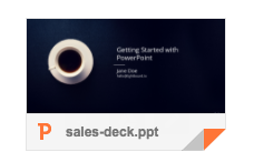
How most of your customers will first see your deck
Know your brand
If you have an established brand, your cover image needs to reflect it. One of the biggest problems we see with decks out in the wild is when the creator goes off-brand and uses the wrong colors or typeface. Imagine how surprising it would be to see a presentation from Coca-Cola without their trademark red, or Facebook without their blue.
Cover Image Techniques
Now that we have the basics down, here are some techniques you can use make a well-designed cover image.
Stock Photography
The workhorse of cover images is stock photography—an attractive photo with plenty of negative space, then place your text on top of it. The trick is to find the right photo and make it work for you. Pexels is a great place to find free images you can use anywhere. When you're looking for stock photos, keep these tips in mind to help you find the right image.
Sometimes you'll need to do a quick bit of editing to make the image work for you. The important thing is to find an image that works in the background—one that lets your reader focus on your message, not the photo. These images tend to look boring all by themselves—you need to use a bit of imagination to see how it will work once you layer text on it.

Original image, edited to 16:9, then with text added
Once you have an image, you can desaturate and tint it to give it better contrast for your text, or manipulate the image to give it more negative space, as you see below.

Editing a stock photo to make it work for a 16:9 slide
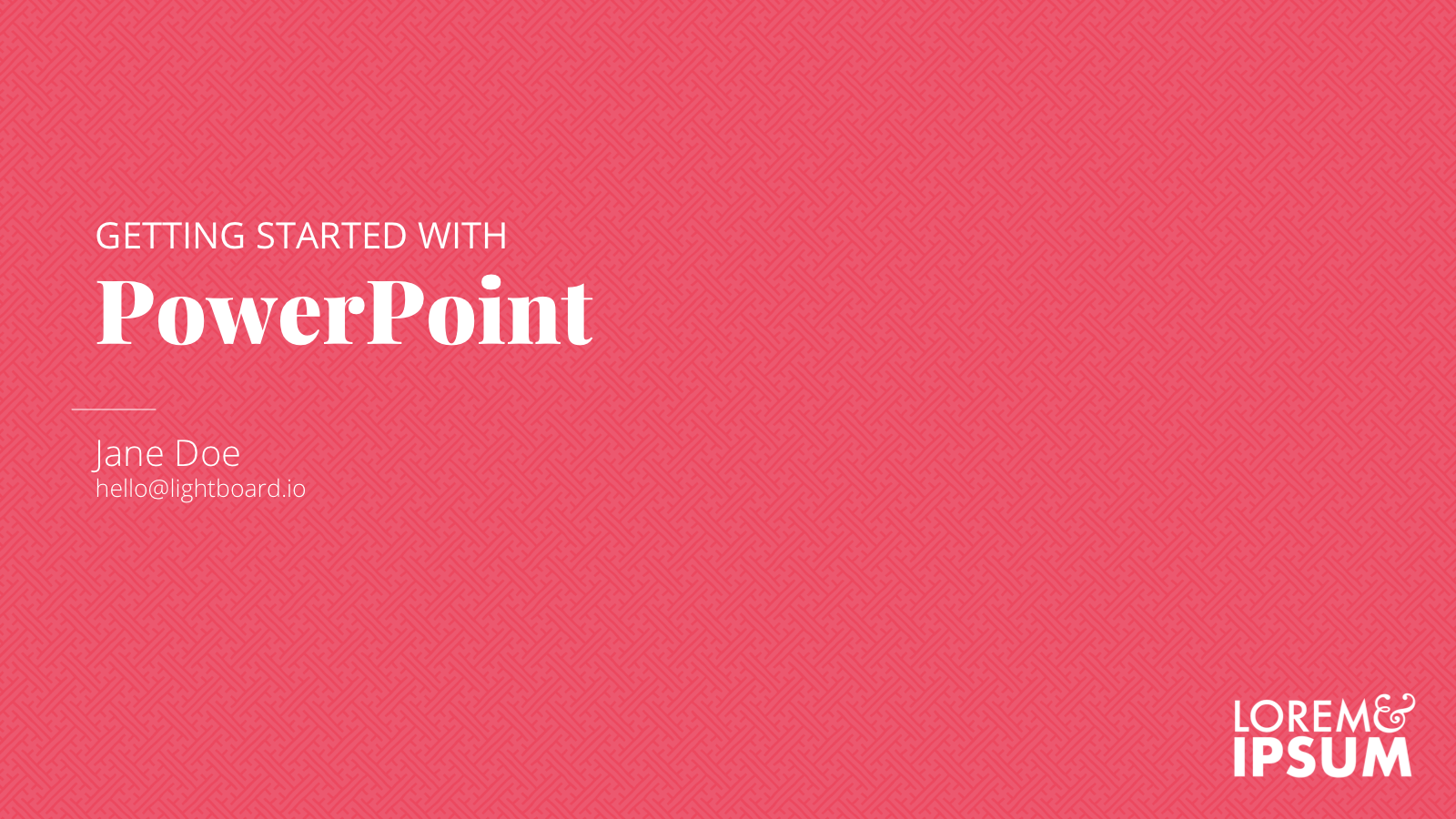
Typographic
Nice typography will take a you a long way, and it's something you can do in PowerPoint without any special tools. We're in a renaissance of great, free fonts. Take a look at this selection of the best Google Fonts from the always awesome TypeWolf for inspiration.
Using custom fonts can be tricky in PowerPoint. If you're having trouble getting your fonts to show up, take a look at this article. If you're sharing the PowerPoint with others, they'll need to have the fonts installed (we recommend always exporting your deck to PDF before sharing with customers to avoid font problems).
Minimalist
We all know PowerPoint isn't the greatest design tool—but it does the basics well enough, and you can use it to make a minimal design that works well.
Even though they're "easy" to do, with the right layout and sense of balance you can make a design that really sings with hardly any design elements.
Strong color combinations, simple shapes, and nice typography can yield a cover page that looks great without searching for stock images or opening Photoshop. Need a little help with color combinations? Check out Kuler from Adobe.
Free PowerPoint Cover Page Templates
We've made examples of the styles above for you to download and use. These are completely free—do whatever you like with them!
Coffee Cup PowerPoint Cover
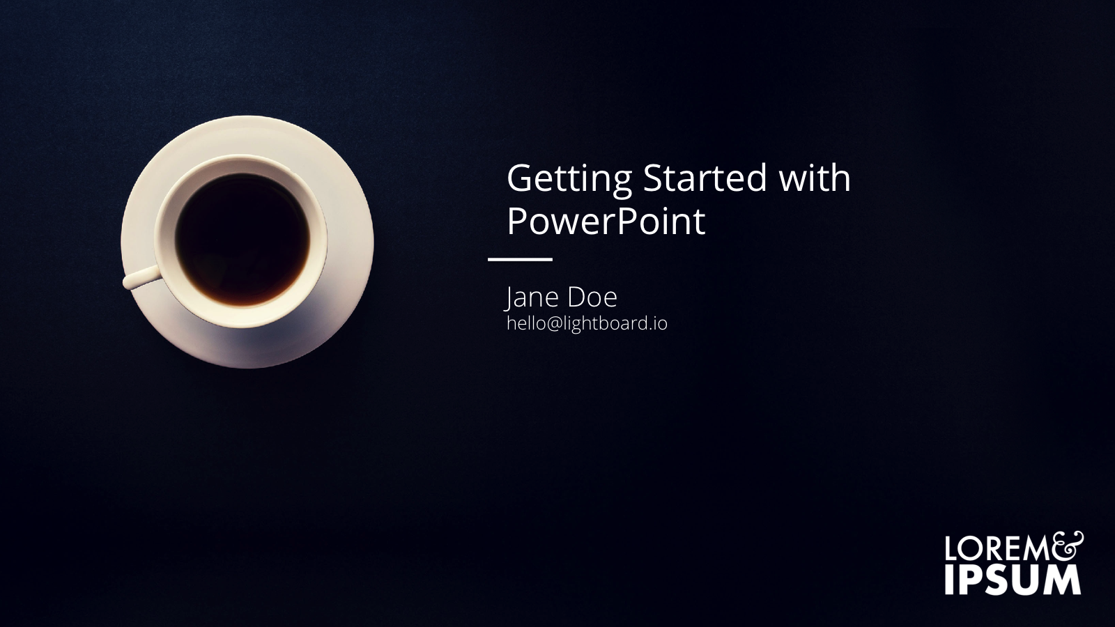 Requires Open Sans
Download PowerPoint File
Beach PowerPoint Cover
 Requires Playfair Display
Download PowerPoint File
Office Building PowerPoint Cover
 Requires Open Sans and Playfair Display
Download PowerPoint File
Circles PowerPoint Cover
 Requires Open Sans and Playfair Display
Download PowerPoint File
Bridge PowerPoint Cover
 Requires Open Sans and Playfair Display
Download PowerPoint File
Desk PowerPoint Cover
 Requires Open Sans and Playfair Display
Download PowerPoint File
Design Tools PowerPoint Cover
 Requires Open Sans and Playfair Display
Download PowerPoint File
Simple PowerPoint Cover
 Requires Open Sans and Playfair Display
Download PowerPoint File
Tiled Background PowerPoint Cover
 Requires Open Sans and Playfair Display
Download PowerPoint File
Topographic Background PowerPoint Cover
 Requires Open Sans and Playfair Display
Download PowerPoint File
Enjoy! If you need some ideas to get you started, take a look at our portfolio of decks we've designed. Or if you'd like a little help on your next project, we're happy to help.